
Material Palette Visual Study
A close material study showing how stone, timber, render, glazing and planting work together around an entry.
- Exterior Renders
- Interior Visuals
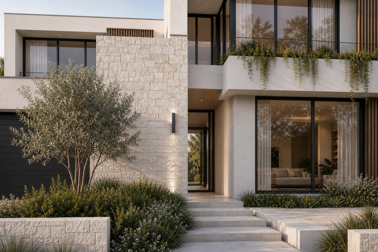
A closer visual language for material and finish discussion
This study moves closer than a typical marketing hero so the relationships between stone coursing, timber screens, render, glass and planting can be discussed clearly.
The supporting whole-house view keeps those details connected to the larger architectural composition rather than presenting them as isolated swatches.
The brief
Create a tactile material-focused image that supports finish conversations while remaining part of a complete residential visual story.
Visual direction
Soft side light reveals texture without exaggeration. Pale stone and render are separated through shadow, while timber and bronze details add controlled warmth.
A visual sequence, not a single image.
Each view has a specific communication role while staying consistent in material, light and atmosphere.
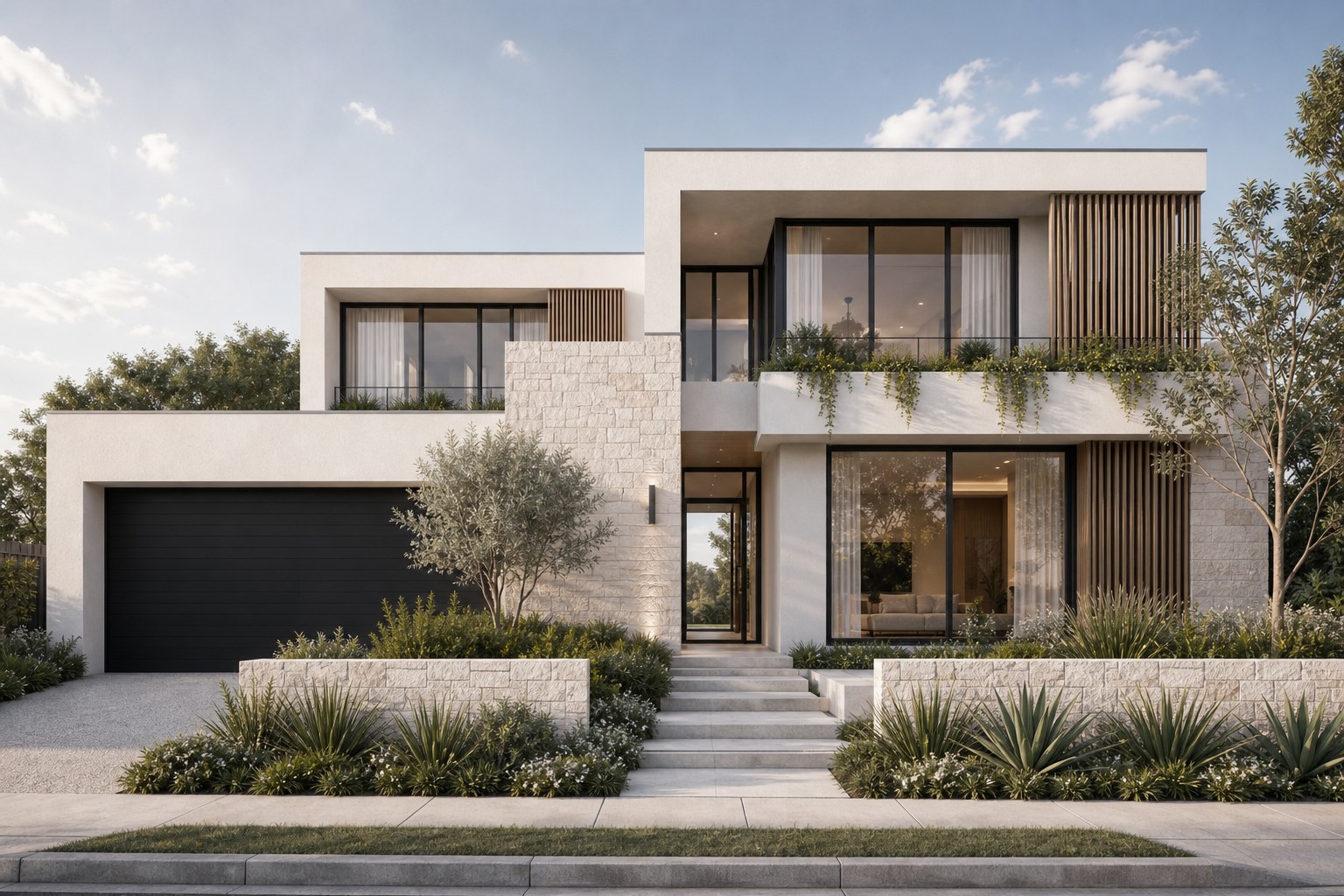
What the image set is designed to explain.
- 01
Material junctions are visible at a useful scale
- 02
Entry depth and planting soften the facade
- 03
Close and wide views use one consistent finish palette
Planning something similar?
Send us your plans and project references.
Plans and references are enough to start.